
Speechless — Premium Concierge & MICE Service

An Israeli concierge and MICE company with 20 years in business. Over two decades it grew from a ticketing-and-troubleshooting agency into a full-scale partner for corporate events, business travel and private experiences.
Its name, ‘Expert Travel’, still kept it in the travel-agency category.
Build a brand that matches the scale the business had already reached. Lift it out of the travel category, speak to entrepreneurs and senior executives as equals, and set the highest level of expectations from the very first contact.
— Business Diagnostics & Founder Interviews
— Market & Competitor Audit
— Brand Strategy & Positioning
— Brand Platform & Philosophy
— Naming & Descriptor
— Brand Architecture
— Visual Identity
— Tone of Voice & Key Messages
— Branded Objects
— Brandbook
— Creative Direction

The company started as a reliable fixer: tickets, hotels, last-minute problems.
Over twenty years it grew into something much larger. Corporate events, conferences, business travel and private experiences for entrepreneurs and senior executives.
The name stayed the same: Expert Travel.
And the word “travel” pulled every conversation back to booking tickets.
“We’ve been growing for twenty years. Today we offer full MICE packages. Yet people still have us saved in their contacts as a ‘trouble coordinators’.
We have to step out of the shadow.
We need a powerful title.
An image as big as what we’ve become.”
— The Founder
Twenty years of trust hidden behind one small word: ‘travel’.

Clients were buying one thing:
I wanted an image that speaks louder than a thousand words.
One contact, and the client says it himself: “these people are powerful, and their approach is truly personal.
- The category:
- Blends into white noise, circling the same premium-VIP-luxury vocabulary.
- Our brand:
- Says less. Delivers more. The client finishes the sentence.
The market was shouting.
The clients wanted certainty.
It was time to step out of the shadow.
Quietly.

Here everything starts with the founder. He is charged with energy, and the whole company inherits it.
The team takes full responsibility for its actions.
It works 365 days a year, January 1st included.
And when a task calls for a new skill, it masters it fast.
An ambitious enthusiast with a code of honor.
Always moving. Always hungry for more.
Ready to go all the way for the best service possible.


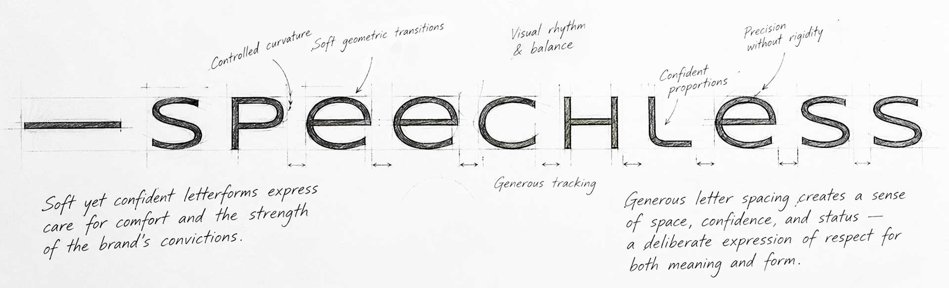
A dash opens direct speech. So the name becomes a line spoken by the client: his reaction after the service.
The category praises itself. This brand quotes its clients.
Every time the logo shows up, a client is talking.

The clients got their word.
The founder still needed his title:


Swap one word and it all falls apart.
“CAN buy” turns it into a shop.
“CAN’T” builds a world of its own.
Here even the wealthiest client walks in and plays by the brand’s terms.
- YESTERDAY:
- ‘Expert Travel’, a trouble coordinator and a ticket seller.
- FROM NOW ON:
- —Speechless.
A service money can’t buy.
The category’s favorite words? Down there.

The founder got his title. Now the brand needed a face.

The founder wanted out of the shadow. Yet the service itself works like a 🥷ninja🥷: no noise, no dust, totally seamless. The identity had to carry both.
The brand gets noticed.
The work stays invisible.
I built that balance into every detail.
I saw three distinct service lines in that mix. And proposed giving each its own place in the brand:
Speechless.MICE
Conferences, corporate events and incentive trips.
Speechless.Business
Personal business support for owners and executives.
Speechless.Experience
Private, made-to-order escapes. An elephant safari. A crafted theme park far from Disneyland. A day on a private island in the Maldives.
Each direction gets its own colored tag under the wordmark.
The system scales. The brand stays whole.
I already had the brand’s defining line: ‘A service money can’t buy’
And the key was right there — SERVICE.
It described the very thing that connected all three divisions.
So I built a verbal system around it — giving each service its own signature while keeping the same brand promise.

White is the canvas. Black is the ink.
Together they say precision, focus and zero compromise. A base that outlives trends.

The color everyone waits for. The green corridor at customs. The call button. A green light. “Route found.” “Payment approved.”

The glow of event screens, LED walls and tech-driven venues.

Cool navy shifting toward chrome. Stability, professional distance, confidence.

MICE. Business. Experience.
The service changes. The promise stays.
Each has its own expertise. Each carries the same standard of service.
And every time that promise appears, it leads back to one name:
— Speechless.

Speechless has a bold personality. Ambitious. Confident. With a sharp sense of humour.
I wanted that character to reach beyond the logo and become part of the client’s world.
So I designed a collection of branded objects. Each one tells a little story about what Speechless believes in.
And each one makes people feel Speechless in its own way.

Straight out of everyday pop culture. The kind of wrapper everyone knows.
I took that familiar, mass-market look and gave it the Speechless treatment.
Playful on the outside. A surprise on the inside — one that brings you closer to the brand’s philosophy.
What’s under the wrapper?
Well, there’s only one way to find out — become a Speechless client 😎
Speechless operates in a world of serious decisions, big budgets and sky-high expectations. And it has the courage to think differently.
Your ambitions will always make someone uncomfortable. Raise eyebrows. Even spark outrage.
We believe ambition is a right.

In business, everything seems to be measured in money.
But those who build something truly big know a different truth: time is the most valuable resource.
That inspired my Speechless take on the old saying: “Time is money.”

Speechless knows what every serious player knows: big ambitions take the courage to claim what’s yours.
And this little artefact carries one bold belief:
Opportunities belong to those who seize them.


I heard a request for status.
The business had already earned it.
The brand had to claim it.